Thursday, September 30, 2010

TESC 129 - 2nd Submission

Hi all! I have another submission for the Taylored Expressions Sketch Challenge #129. I wasn't too happy with the first one I submitted. I think I have some of my mojo back with me tonight! Haha! Here's the sketch:


I started with the patterned papers for inspiration. I just love the combination of sophisticated and whimsical in one surface. The yellow patterned paper is one of my favorite patterned papers from Cosmo Cricket. I was a little stuck as to what to put in the middle. I don't really have big stamps that make an entire scene. Instead, I picked up my circular border stamp from Inkadinkado. It came with the butterfly and it was perfect for the center of the card. It was a bit big though, I hope you can still see the Martha Stewart edge punch back there.  I also added the ribbon because it looked like something was missing back there. I love the rich olive color of it. I thought it added a lot to the card. :) 


Supplies:
Cardstock - kraft, white (PTI), cream (Paper Company)
Patterned Papers - Everafter (Cosmo Cricket), Lush (My Mind's Eye)
Stamps - medallion, butterfly (Inkadinkado), banner (TPC Studio). sentiment (PTI)
Others - edge punch (Martha Stewart), ribbon (Wendy), pearls (Recollections)

Wednesday, September 29, 2010

Colour Q Challenge #52

Hi everyone! I have a submission for the Colour Q challenge #52 tonight. It's a different challenge, combining a sketch and a previous color combination. I must admit, I found this sketch a bit of a challenge in itself. The color combination I chose actually helped things move along. Before I go on and on about it, here's the sketch and the color combination I chose for this challenge.


I just got my Embrace Life stamp set from Stampin' Up today. I instantly wanted to use it on the card I was making today. Aren't these flowers just sweet? I actually borrowed a technique I learned from Nance over at Canopy Crafts. Thanks Nance! I inked my embossing folder with Versamark before I ran it through the machine. The color difference is very subtle but I like it a lot. I tried to keep it simple but sweet. :)

]

Supplies:
Cardstock - kraft, vintage cream (PTI), black, peach (Paper Company)
Patterned Paper - Lush (My Mind's Eye)
Stamps - Embrace Life (SU), Damask Designs (PTI)
Others - Fancy Tags (Spellbinders), pearls (Recollections)


I know I promised to make some flowers tonight, but I'm just so tired that I couldn't make any. Perhaps if I have time tomorrow I can make some for you ladies. A friend of mine actually encouraged me to start making more flowers to sell over at Etsy. I'm not so sure about it just yet. I don't know if there's a market for it since there are Prima flowers everywhere and they're very easy to get. And I'm not so sure if I have the patience to make that many flowers! Hee! :) Let me know what you ladies think ok? Thanks! Good night all!!!


Handmade Paper Flowers - Round 2

Hi everyone! This is my second post for the evening. If you want to see the first one just scroll down. Just a short post before I'm off. I was making some paper flowers tonight and I wanted to share some of what I've made with you all! :) It's the same die from Tim Holtz, I just distressed it differently this time! And guess what came out! Roses!!!! Well, it looks like roses to me! Hee! :) Here they are. I hope you like them!


Here's a close up of one. This time I didn't distress the petals so much and I curled the edges. I was looking at some paper flowers on some cards that I'd seen. I think they're Prima flowers. Anyway, one flower had its petals curled just this way. So I thought I would go ahead and give it a try and see what happens...THIS is what happened! :)


I found that inking a cream flower looks better than actually using different colored cardstock. I'll try to make some more tomorrow using some inking. Maybe I can show you again tomorrow. :) That's it for tonight! Good night everyone! Thanks for stopping by!


Tuesday, September 28, 2010

Shabby Tea Room: Week 29 - Pearls and Pastels

Hi peeps! I found a wonderful website for shabby chic card challenges! It's called the Shabby Tea Room. I know I haven't perfected the style yet and I'm not consistent with my submissions. But it's worth the shot! :) I just couldn't resist joining this challenge. For their inspiration, they had this picture of a gorgeous bracelet. 


I came up with this card. I wanted to use different shades of pink, aqua and white which made up most of the color palette of the bracelet. I added the kraft and brown just to balance things around. I stamped the background papers. The aqua strip on top was actually white, then I inked it up with some aqua ink and lightly stamped it with some text background.

For the bottom portion, I stamped a flower from my Inkadinkado stamp set around the edges of the white cardstock. Afterwards, I thought there was too much white space. So I stamped some swirls in very very light aqua ink to fill in those spaces. I think it ended up really great!


I handmade this paper flower. I used my Tim Holtz flower die again, this time I changed the way I distressed the petals. It turned out so great! I was so happy with it! I think I'll be making some more of it, this time in different colors! :) The strip in the center was also white, I inked it with Tattered rose distress ink, stamped more background text on it and stamped the dragonfly right in the center. 


Supplies:
Cardstock - kraft, white (PTI)
Stamps - flowers, dragonfly, swirls (Inkadinkado), sentiment, background text (PTI)
Others - ribbon, lace (Offray), rose (handmade)


Monday, September 27, 2010

Waltzing Mouse Sketch Challenge # 16 - 2nd Submission

Hi friends! I have one last submission for tonight! Yes, it's another second submission. For some reason I wasn't happy with the ones I sent ahead! I should really take the time to think about these sketches before I send them to avoid these resubmissions. Anyway, here's the sketch


I started with the pink background paper from Making Memories, and from there started to build the card. I wanted to use this vine from my Turning a New Leaf stamp set from PTI. Can you believe I've had this set for quite some time now but have never used this one?! Anyway, there's always a time for things. I thought it added something to the patterned paper and yet was subtle enough behind the strips of cream cardstock. I stamped those with En Francais and distressed them. I used Tattered Rose distress ink to ink up all my cardstock and patterned paper.I really love this distress ink! I just got it this weekend and I've been using it a lot, specially for making paper flowers.


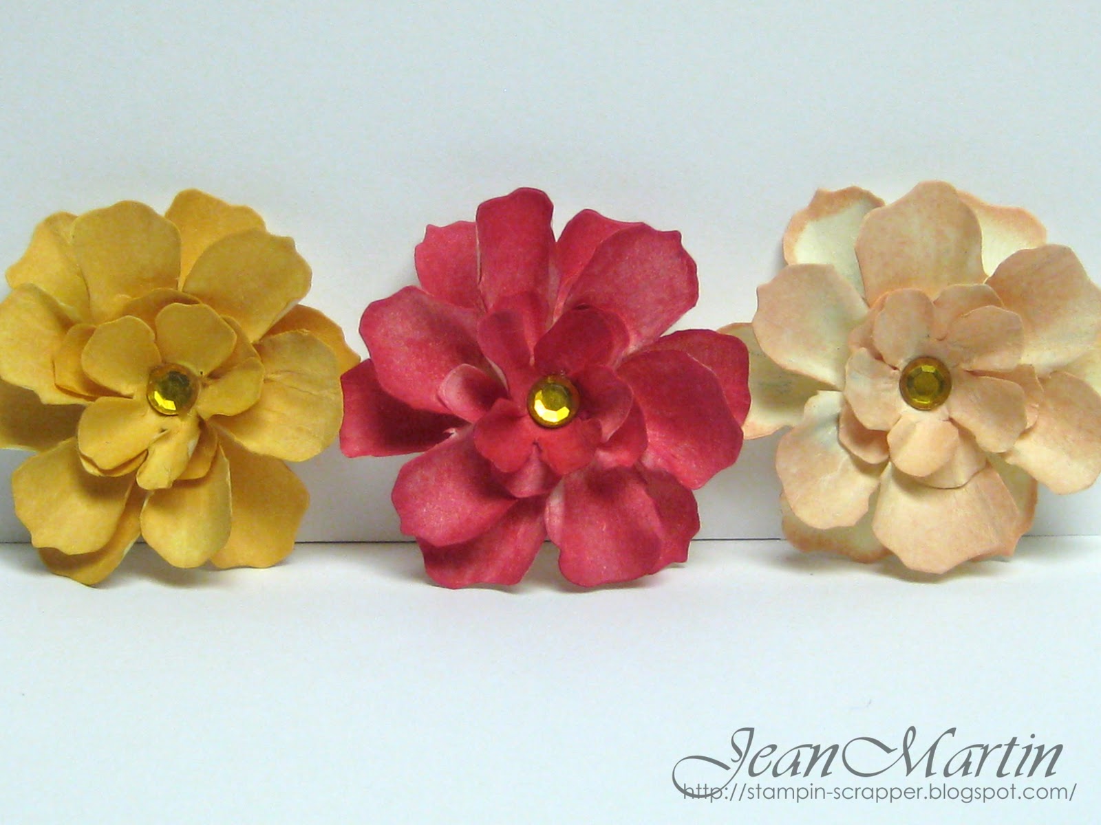
Speaking of paper flowers, here's another one I made. I used the EK Success 1 inch flower punch for this one. You can make all sorts of flowers with ANY flower punch or die...at least I think you can. (Haven't really tried it yet!) You just have to play around with how you distress the petals. 


Did you notice the difference in colors/shades of the pictures? I used a different setting on the first one. Which one looks better? The first one or the others that come after it? I'm still not happy with my pictures. I wish I had a light box, but those cost about over $100 I think, and I'm not really in the mood to spend that amount for a light box at the moment. Oh well, I guess I just have to toggle with the settings of my camera. That's it for tonight! Good night ladies! Have a great week, and thanks for stopping by!

Supplies:
Cardstock - kraft, vintage cream (PTI)
Patterned Paper - Note Worthy (Making Memories)
Stamps - Turning a New Leaf, Beautiful Blooms 2, Damask Designs (PTI), En Francais (SU)
Others - Fancy Tags (Spellbinders), flower punch (EK Success)
.


Card Patterns Sketch 83 - #2

Hi everyone! I hope you're having a good start to your week. I have another submission for Card Patterns Sketch 83. I wasn't too happy with my first one and came up with this one instead. I made a few modifications on the sketch to fit the idea I had in my mind. Before I show you, here's the sketch.


As you can see instead of the big oval in the center, I decided to slice it and place a flower in the middle. It still sort of is an oval/circle because of the flower. I just added the half doily beneath the flower. I got this idea from Heather. Thanks Heather! I also used a ribbon to cover the edge of the center mat.


I don't know if you can see it very well, but I embossed the cream mat just above the kraft card base. I actually used a letterpress printing plate. I guess the cardstock couldn't handle the pressure so much so there were little cracks in some parts. But it was actually great because it made it look more vintage! I hope this submission still falls under that sketch. I enjoyed making it! I hope you all like it! Thanks for stopping by!


Supplies:
Cardstock - kraft, sweet blush (PTI), cream (Paper Company)
Stamps - sentiment (PTI), flourish (Prima)
Others - lace, ribbon (Offray), flower (handmade), doily (Michael's), letterpress plate (L)


Sunday, September 26, 2010

TESC 129

Hi everyone! I have just one more card for tonight. This one is for Taylored Expressions Sketch Challenge #129. It's been such a relaxing Sunday that I've forgotten some things that need my attention! :) Too much time on that crafting desk! Here's the sketch for this challenge.


I made a very feminine card. I was looking through Nichole Heady's blog today and noticed that she loves to use Berry Sorbet. So I grabbed mine and started stamping away! The flower on the Berry Sorbet is from Friends Till the End and the flourish on the Sweet Blush is from Prima. I just love that flourish! Isn't it pretty in pink? :) I used the paper flower I made last night. I hope there aren't too many flowers on my card. But then again, you can never have too much flowers! :) Enjoy the rest of your Sunday! Good night!


Supplies:
Cardstock - Sweet Blush, Berry Sorbet, Spring Moss (PTI), cream, kraft (Paper Company)
Stamps - Friends Till the End, Big and Bold Wishes (PTI), flourish (Prima)
Others - dies (Spellbinders), buttons (Walmart), edge punch (Fiskars)

Card Patterns Sketch 83

Hi everyone! I have a simple card for you today. I noticed that I had been making so many shabby chic cards lately that I've stopped with my clean and simple cards. Well, it was actually hard to get back into the beat of making them after having made several shabby chic cards. Before I go on and on, here's the sketch for Card Patterns 83.


I can't begin to tell you how I mulled over this sketch. I think I sat there the entire morning just staring at the cardstock not sure what to do. It seems an easy enough sketch to follow right? But for some reason, my mojo was out for the day. Haha! I like the color combination I chose, but I'm not too sure about the design. The paper flowers I made from a, EK Success punch that I just layered. I'm really enjoying making these paper flowers. And I'm trying to make them in a way that isn't too tedious but still come up with something nice. Some people have been asking for a tutorial on how to make them.  If I ever get a video camera (Yes, I don't own one. I just never found the need to have one.) I'll try to make a tutorial for the flowers I've been making. It's just not the same to just take pictures of the process. Anyway, here's my clean and simple card for today. Thanks for stopping by!


Curtain Call Color Challenge Act 49

Hi everyone! I'm back for my last post for tonight. It's time for the Curtain Call Color Challenge again! Get ready for this one! Stacey chose a gorgeous, rich color combination for this challenge. Isn't this just beautiful? I was so excited to make a card using these colors when I first saw it.  Here's the Curtain Call Color Challenge Act 49.


This color combination reminded me of Christmas. My Snow Swirled stamp set from Stampin' Up just arrived a week ago, and it seemed perfect for this card. I made the background using the snowflakes and stamped it in different colors. I love how it turned out. I actually made this card this past Tuesday. :) I try to make my Curtain Call cards way before I post them on Sundays. I don't want to find myself without any ideas  before the deadline. I hope I've provided you all with a lot of inspiration this September. And I look forward to playing with all of you this coming October! 


Supplies:
Cardstock - vintage cream, pure poppy (PTI), black, sand, brown (Paper Company)
Stamps - Snow Swirled (SU)
Others - edge punch (EK Success), ribbon (Offray), button, twine (Walmart), pearls (Recollections), label die (Spellbinders)


The Curtain Call Crew has samples to show you today, too, so make sure you stop by to see:


Introducing...
Christina MacLaren at Seaglass & Sentiments
Julie Lacey at Stamps & Taxes
Laurel Seabrook at Seabrook Designs
Makiko Jones at MakInk Studio
Monika Davis at M.A.D. Stamper
Piali Biswas at Touch of Creation
Silke Ledlow at My Life
Stacey Schafer at Stacey's Stamping Stage
Teresa Kline at Enjoy the VA Sunshine


and September Guest Designer, Vicki Dutcher at All I Do is Stamp.


...then play along with us and post your Curtain Call Color Challenge creation using Mr. Linky over at Stacey's Stamping Stage.

Saturday, September 25, 2010

Handmade Paper Flowers

Hi everyone! Ok, so I have been a busy bee today. I wanted to try a new technique on my Tattered Flowers. I just love this die from Sizzix. You can make so many different flowers from just this one die! I die cut a couple of flowers using the medium and small sized flowers in the big die. Then I inked them with red, yellow, and peach. I distressed them and layered them one over the other. Here's what they look like. I just love it! I also took some close ups so you can see the flowers in detail.


Oops...please excuse my inky fingers! Hee! :)

September 2010 Papertrey Blog Hop

Hi everyone! I ALMOST missed the Papertrey Blog Hop again!!! Thank goodness it's for an entire day! Whew! :) 


So this month's challenge is to share something that you've learned from a fellow stamper. My card was inspired by Melissa Phillips. I just love her Shabby Chic/Vintage style. I've always just adoringly looked at blogs and magazines when it comes to this style. I must say I really had a hard time with it. I tried so many times to make my own version of it, but for some reason, I was really BAD at it! Haha!

I gradually learned how to make my own shabby chic cards just by looking through Melissa's fantastic work. She always makes stunning projects no matter what the occasion. I love all the soft colors that she always uses. And I'm utterly amazed at how she can make a Halloween card look shabby/vintage! My card for the Blog Hop is MY version of shabby chic! I hope you like it!


Supplies:
Cardstock - kraft, white (PTI)
Stamps - butterfly, flowers (Inkadinkado), En Francais, sentiment (SU)
Inks - aqua mist (PTI), ice blue (Clearsnap), black (Memories), distress ink (Ranger)
Others - ribbon, lace (Offray), twine, beads (Michael's), flowers (Prima)


Waltzing Mouse Sketch #16

Hi! I'm back for another post this morning. I'll just make this a quick one. Here's the Waltzing Mouse Sketch #16.


I used patterned paper from Cosmo Cricket to be the highlight of the card. I just love the Everafter collection. The colors are so subtle and dramatic. I also used Fancy Tags from Spellbinders to place my sentiment in. I just love this set from Spellbinders. There's also a little flower that I placed behind the tag just for a little more color to the card. Enjoy the rest of your day!


Supplies:
Cardstock - white (PTI)
Patterned Paper - Everafter (Cosmo Cricket)
Stamps - Violets, Damask Designs (PTI)
Others - button (Walmart), Fancy Tags (Spellbinders), edge punch (EK Success)


Embellish Magazine Color Challenge Using Background Stamping

Hi friends! Embellish Magazine has another color challenge, this time using background stamping. I really love the color combination and was thinking of building a background using different stamps. But then I suddenly decided to go with heat embossing. Before I go on about how I assembled my card, here's Embellish Magazine's Color Challenge using Background Stamping.


I used Victorian Frippery from Waltzing Mouse to make the background of my card. I stamped the images with Versamart Ink and heat embossed it with silver embossing powder. I wanted a little shine on the card without using too much bling. I dry embossed my center panel and punched the edges. I was wondering after I made the card if that was even worth it, because you can barely see it under that huge ribbon! Haha! Oh well! It still looks good to me anyway! :)


The frame underneath the ribbon was made with my Cricut. I made a whole bunch of them with this very very thick cardstock. It's so thick it's almost like chipboard. I actually found it at my husband's local comic book store. They sell 100 sheets for $7. I've had them for a long time now and haven't even gotten through half of it! Anyway, I tied the ribbon twice to make it look big and tied the pearl button in the middle. I just love adding twine to ribbons. I think they add a lot of texture to what's already there.


I actually took the picture during the day hoping it would turn out beautifully. But it's a little gloomy out so I didn't get the full effect I wanted. Nevertheless, I still like the end result. Enjoy your Saturday everyone! I'll probably have some more cards out later on today. Thanks for stopping by!

Supplies:
Cardstock - white, lemon tart (PTI), light gray, black (Paper Company)
Stamps - Victorian Frippery (Waltzing Mouse), sentiment (SU)
Others - antique white ribbon (Offray), twine (Michael's), button (Walmart), edge punch (EK Success)


LinkWithin

Related Posts with Thumbnails