


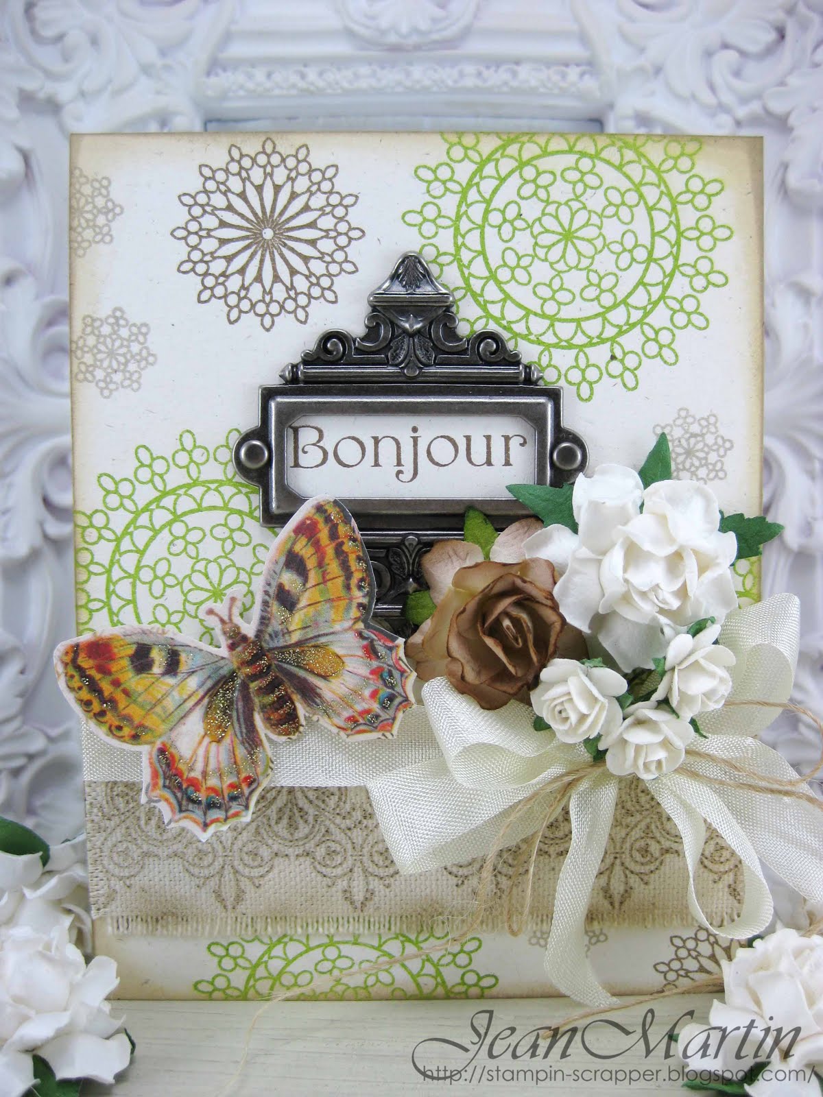
Didn't I say it was a lovely neutral combination? The images have enough pop of green color in there though, which I found beautiful. Here's my card. I took several pictures of it. I also tried changing the backgrounds...white to black...I thought perhaps the contrast would be good. Tell me what you think...I'm only experimenting with my pictures because I don't really know anything about it...does it look better with the white background...or the black...
I combined some of my favorite stamps...of course you already know my favorite WMS stamp set...Victorian Frippery...I stamped the gorgeous border flourish on a piece of canvas. I frayed the edges and inked it. For the background, I used Mehndi Medallions from WPlus9.


This is absolutely stunning!!! I love everything about this!
ReplyDeleteWhat a beautiful card.
ReplyDeleteWow, Jean, this is absolutely, over the moon GORGEOUS!!!
ReplyDeletevery beautiful card
ReplyDeleteLove, love, LOVE your gorgeous, stamped background, Jean! And your collection of textural elements is to die for! I especially love the fringe on that piece of fabric! Yummy! Thanks so much for joining us this week at The Play Date Cafe!
ReplyDeleteJean this card is delightfully beautiful :) Such a lovely combination of elements and a beautiful balance of colours... I (personal opinion only) prefer the white background to the black. Thanks for joining in the fun at the Play Date Cafe this week :)
ReplyDeleteStunning, Jean. I love the Mehndi background and piece of fabric. I like the whote better, but I think it is the texture to the white that I prefer. If the black had texture like the white it would look just as good. BUT...I think you have done a great job with your photos. I need to find something to put behind my cards. I have looked and found nothing. :)
ReplyDeleteHugs~
GORGEOUS card and stamping Jean!!! LOVE all those flower embs too! Thanks for joining us at The Play Date Cafe :)
ReplyDeleteVery pretty card. Love the stamping designs
ReplyDeleteAll of your photos display your card beautifully, Jean, I don't think I could pick a favorite as they are all equally gorgeous! I adore your style...the fabulous vintage accents, downright lovely flower/ribbons and the all around girliness just appeals to my ultra-feminine side! Rock on, girlie...and maybe we can get you out of your little comfort zone and try some bolder colors?...maybe...
ReplyDeleteGlad to see you over in the Cafe...come back now, ya hear?
That frame and sentiment pair perfectly with those colors and that background stamp. Such fun embellies. Thanks for playing along at The Play Date cAfe.
ReplyDeleteAbsolutely gorgeous! I love everything about this card! I have also been looking at your previous cards and all of them are beautiful.
ReplyDeleteThis is absolutely stunning Jean! Love the way you've used the colors in the background. And the little cluster of flowers reminds me of a bridal bouquet.
ReplyDeletePure beauty........there is always something gorgeous to look at on your blog!
ReplyDelete